Search This Blog

Monday 19 November 2012

Lino Blocks, Chine-collé, Arabic Calligraphy, Fossils, Caves, Giants and Street Pianos!

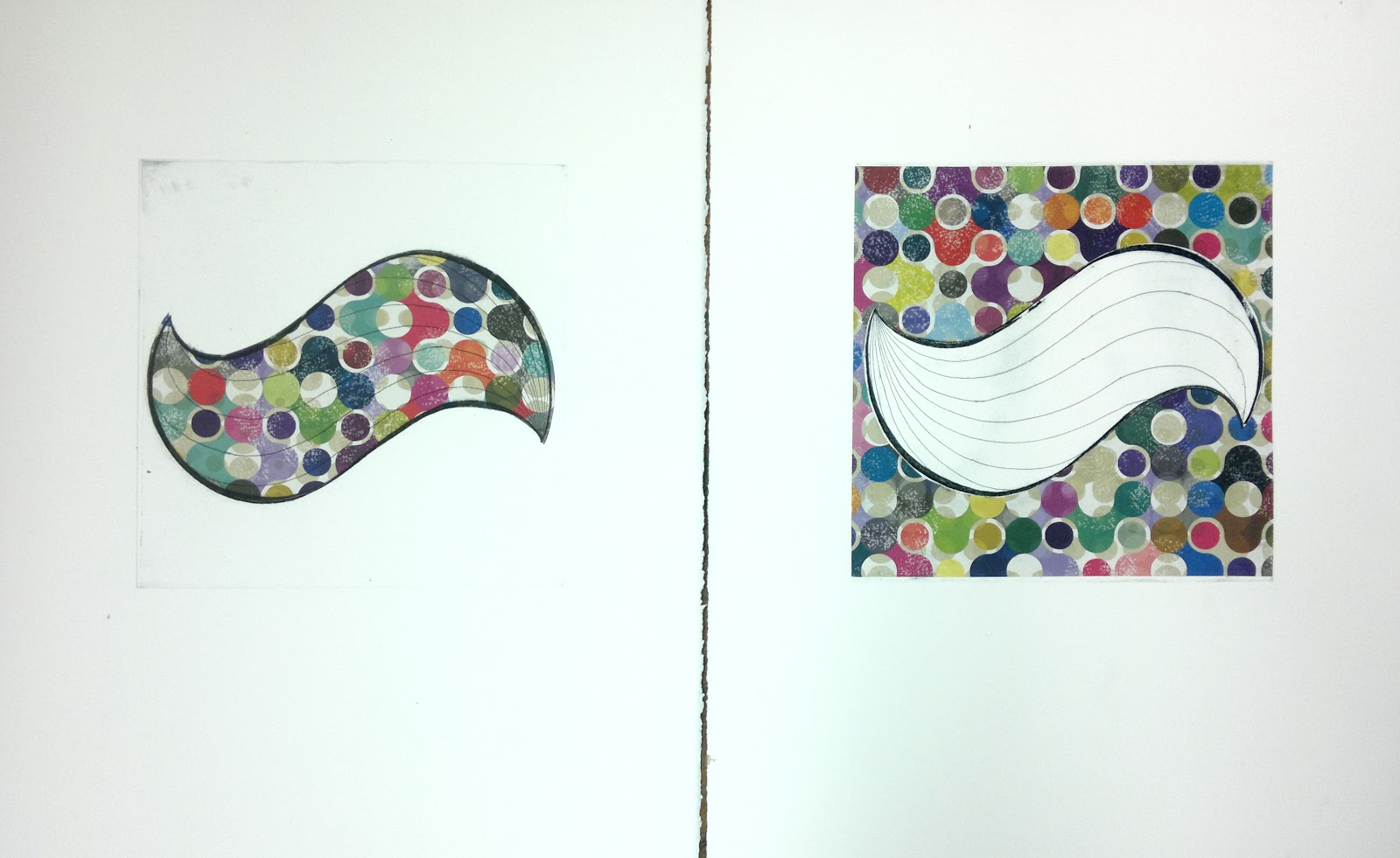
Lino block prints are quite quick and a lot less laborious to print compared with etching so, for the moment, I have been experimenting with this; combining it with one of my favorite techniques: Chine-collé. For these prints I have been using Japanese origami paper and imitation gold leaf with muted blue/grey ink for the single block print on top. The block was inspired by some fossils and minerals I had seen in  the Bristol Museum and Art Gallery on a recent trip to the city. I also looked at The Giant's Causeway in Antrim, Northern Ireland and Fingal's cave, a sea cave on the island of Staffa in the Inner Hebrides of Scotland when designing this block. The forms have changed and are more geometric but still hold organic elements of the original Growth and Process design, as though its developing and changing. 

"Fossil Bloom"


Experimenting with imitation gold leaf

Initial experimentation with imitation gold leaf - still to be mastered but I quite like the results it has shown it that can be achieved


I have also been looking at the work of street artist, Retna, after reading the article, Lost in Translation, in Issue 20 of Very Nearly Almost magazine. He creates his own visual language that doesn't have to be read to be understood. Using a mixture of lively brushstrokes, playful techniques and skill, Retna produces bold, clear and eye-catching murals. I have also been drawing influence from Arabic Calligraphy writer, eL Seed, and the beautiful flowing shapes and curves used in his work. Please take a look at the links provided to see some of their work. 

Mixing all the influences I have been studying, along with my original ideas and concepts, I cut 3 lino blocks that work nicely together. Something a little bit different from my usual work. I originaly planned the blocks to be quite small to allow me to make smaller pieces, therefore offering ease of transport and storage. Although, it turns out that lino blocks work well for tiling, so me being me I have ended up making 3 x 1.5m long banner-type prints. Please not: The photographs included in this blog entry are the beginning of the project, not the finished article. The pieces are now fully printed although I have not yet photographed them in all their glory! My next challenge is how to display them. I was considering keeping them curved and displaying them as 3 half cylinder shapes... watch this space!

Relief printing in a very quiet studio - Luxury!

Enjoying mixing some of my favorite colours

Mixing the original Growth and Process concept with new Arabic Calligraphy inspired shapes

Examining positive and negative space

Hot off the press


Being inspired and looking at other forms of art is also informing my practice and keeping my brain ticking along with new ideas. The recent Festival of Ideas saw the arrival of 15 street pianos dotted around Cambridge, all featuring the inviting text - "Play me. I'm yours." They were decorated with the theme Dreams and Nightmares in mind and stayed around for two weeks between 24/10/12 and 4/11/12. There was one on my route to uni and work which made me smile and brightened up my day every time I passed it. It functioned as a piece of art, a musical instrument and a tool to encourage positive communication. I really loved how these paths crossed and brightened up darkening winter nights for the community and visitors alike.


As I was cycling home one evening there was a man playing the piano that was on my route. I stopped to watch him for a while and take some photographs. As I was doing so, another woman stopped and we ended up chatting, which would not normally happen, all due to the piano! When the man stopped playing, another couple of people who had been watching him started to chat with him. I really enjoyed the power it held, also how accessible and interactive the project was and the way it encouraged communication in such a positive way was brilliant to be a part of. I must admit, I do really miss the pianos! 

At first he played alone...
 
Then he was joined by one to talk about the music...

And then another!
The project also opened my eyes to how many talented people can play the piano in Cambridge! Bravo!

Last but not least, some hardcore printing has lead to some silly (but always controlled!) behavior in the studio. Here's a couple of snaps of me with my cheeky studio technician, Damien. Cleaning up but keeping him in line at the same time!


Saturday 27 October 2012

A New Take on an Old Favourite: Mixing Things up with some Lino Cutting, Rotation Over-Printing and Lots of Bright Colours!

Over summer I had bought a piece of lino to cut and doing so provided me with the perfect relief over the course of an otherwise stressful task - moving house! Taking my favorite shapes out of their natural, fossil-like environment and introducing them to a new, more geometrically based realm, drawing parallels to my own experience. Still drawing similar references to my previous etching style - playing with negating and positive space and the possibilities different layers and transparencies can offer. I drew strong references from a trip to Bristol where I came across some of the most astounding street work I have ever seen after the street art festival, See No Evil.

The lino plate in the final stages of being cut out
Multi tonal, 180 plate rotation print on some beautiful, Japanese, Tosa Washi paper.

My workspace - inking up the tile and having fun mixing bright colours!

Who would have thought one person could use so many cotton wool buds in one go...

Colour proof on newsprint.

My favorite result - in my opinion, the best use of colour from what was produced.


Friday 26 October 2012

Growth and Process: Deconstrusted

Since my post,  Hand Colouring, Stitching, Deconstruction, New Plates,  where I had newly etched 8 new zinc plates, I have been experimenting with them and finding out what exciting range of prints they can offer. Here are some snaps of what has been achieved so far.

A selection of single plate prints


180 Degree flip over printing with a spot of colour. I'm liking the 'decayed' versus 'growth' battle going on in this one.

I played around with very thin, fine layers of soft, heathery coloured inks. The relief etching/off-set prints are fairly quick to achieve so it meant I could try lots of possible outcomes, messing around with overlaying multiple plates and transparencies. Here is one of my favourites.


And then trying vice-verse chine-colle and a touch of good fun to create this colourful diptych.


Tuesday 14 August 2012

A Feature in The Cambridge News and an Exhibition at The Buddhist Centre

I was recently interviewed by Emma Higginbotham from The Cambridge News regarding the Society of Women Artists 151st annual exhibition. Tim Parker from Cambridge School of Art was also interviewed in the same article on his recent success of winning in the Children's Category for the Penguin Books Design award, along with Alison King who came joint second in the Adult's Category. An image of the double page spread as it appeared in the paper is bellow but the whole article can be read online by following this link.


The MA Printmakers are also hosting a group show at the moment at Cambridge Buddhist Centre. The show is open now and is completely free to everyone to go and have a look round. Opening times are between 10am and 1pm Monday to Thursday until 28th August.


We held an open evening on Saturday 11th. It was a great opportunity to do some valuable networking and see some of the printmakers from uni as our studio is now closed for the summer until 25th Sept! I think we are all feeling the strain of not being able to get in there and get our hands on those lovely inks and beautiful presses we all love so much! Here are a few snaps from the evening.

Jane Hellings, Elizabeth Fraser, Tom Robinson and his girlfriend catching up at the Open Evening

A selection of work from the exhibition

My work in the top left, top right: the work of Diana Ashdown, bottom right: Some of Jane Hellings's biscuit prints, to the left of that Lynne Windsors dragonflies and in the bottom left, an etching by Mandy Langford.


Today I bought a new roller and have been busying myself at home by cutting some lino while the studio is closed so watch this space for some new lino relief prints coming soon!

Tuesday 17 July 2012

151st Society of Women Artists Annual Exhibition At The Mall Galleries, London, Exhibitions in Cambridge and Most Importantly: Getting Back in the Studio!

Recently I have been enjoying the summer and keeping my fingers crossed that it will possibly stop raining soon! To escape the rain I took a very inspirational trip to Barcelona where I fell in love with the works of Gaudi after visiting Parc Guell and the spectacular Sagrada Familia (The cathedral that is still being built from the plans that Gaudi left after he died). The shapes and colours use were astounding and both locations, I found, seemed very welcoming.

Some photos from Parc Guell


Some snaps from the Sagrada Familia, which totally took my breath away.


We also went in search of different street art recommended in a guide by, Barcelona graffiti artist, Pez. The guide can be found by following this link. I thought it was really exciting seeing and recognizing artists I have seen in London, especially the infectious smile of Pez's charterers!


Once I returned from Barcelona I had the exhibition opening of the Society of Women Artists' 151st Annual exhibition, which Growth and Process (Broken China) and Growth and Process (Pieces in Place) had been accepted for. HRH Princess Michael of Kent opened the show and there was a great buzz! 


Following from that The Cambridge Open Studios was open at Cambridge Artworks on the first and second weekends of July. It was great to see around all the studios and the place was much bigger than I thought, with a range of different sized studio spaces. There was a great summery atmosphere at the opening evening, despite the odd torrential rain shower! I thought their exhibition area was a very nice space, well lit with lots of natural light and the artists had transformed their studios, but still with traces of the processes they use all around them which I really enjoyed, as much as seeing the wide range of art on display.


I was happy to see a spot of yarn bombing in Cambridge on a sunny afternoon...


Today, I returned to the studio! After a long time-out doing exhibitions etc. it was brilliant to get back in there! I think its important for any type of artists to strike a healthy balance between creating the work, looking at other artists' work and actually getting their own work out there. It felt great to get my hands on some ink again! I ended up experimenting by using Prussian blue, mixed with some black to really tone the blue down and add a bit of life to an other-wise normal black. I was quite happy with the result I got by over-printing the plate 4 times and rotating it. The result seems to have created a new form and yet more possibilities for Growth and Process.......